未来提案|厦门大学创意与创新学院2025毕业设计作品②
发布时间:2025年7月16日 分类:毕业设计 浏览量:1755

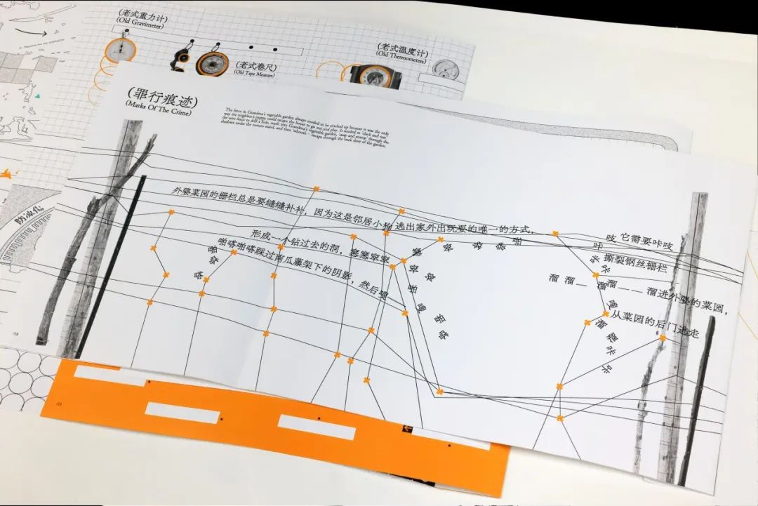
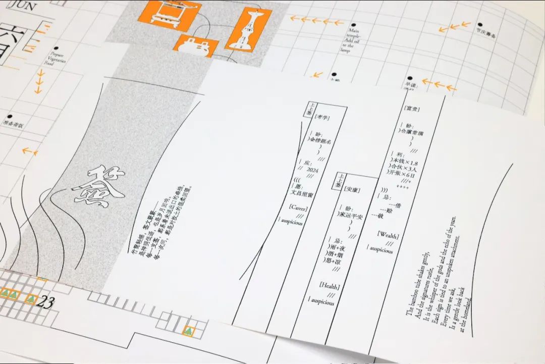
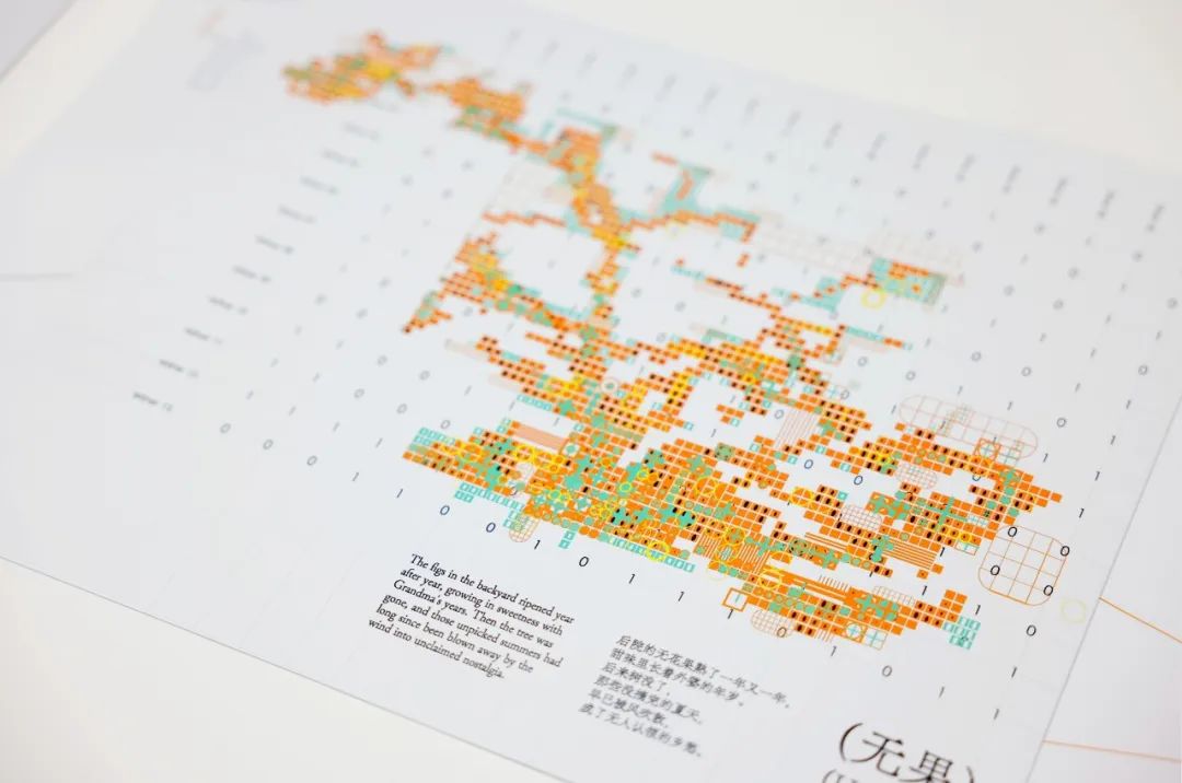
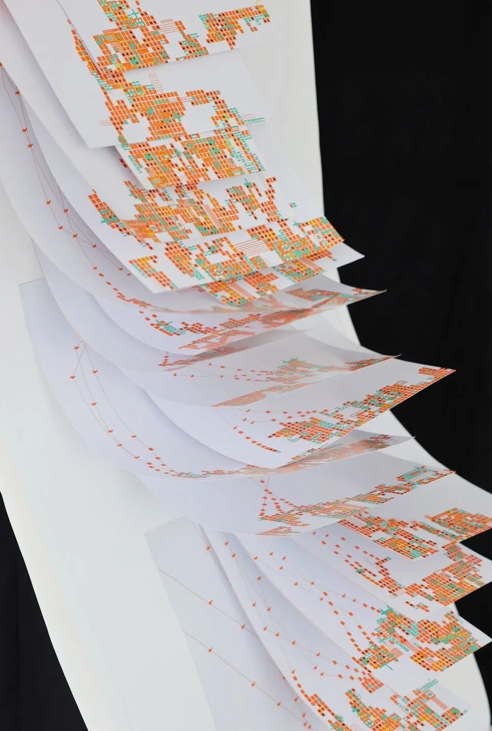
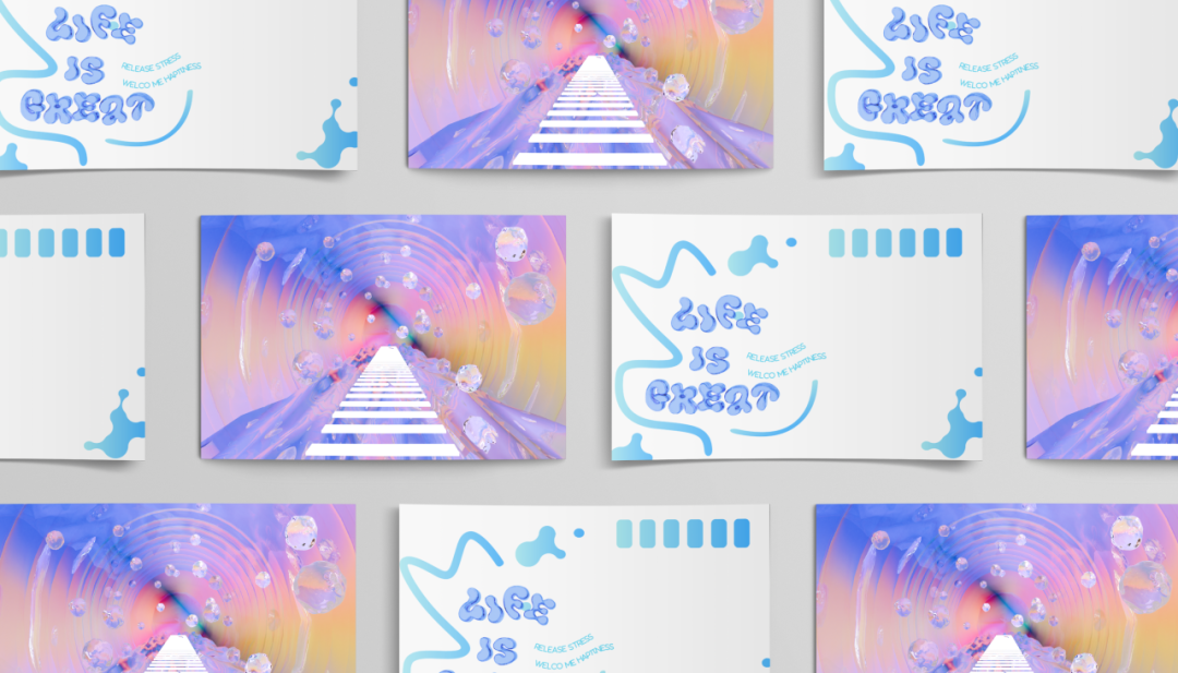
后“码”村
Houma Village
视觉传达设计
Visual Communication Design
李莎淇 LI Shaqi
指导老师|杨双飞 YANG Shuangfei Ruehl Muller
作品介绍 Intro
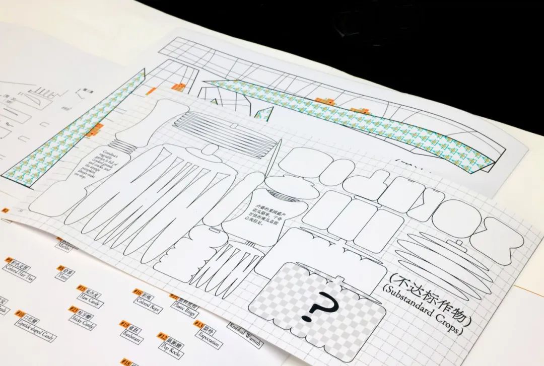
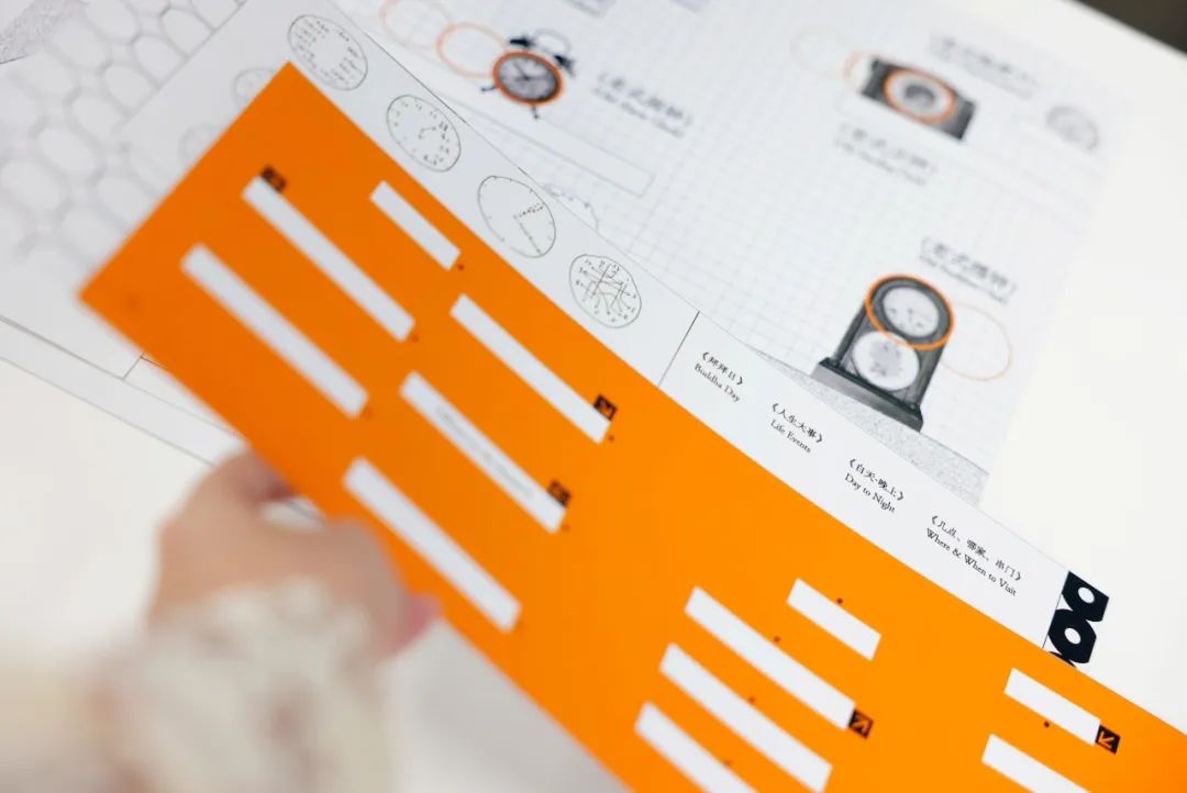
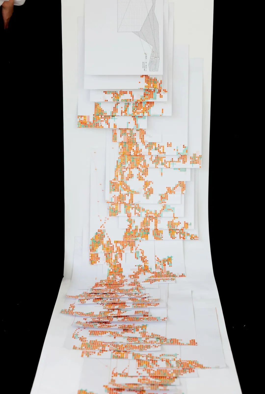
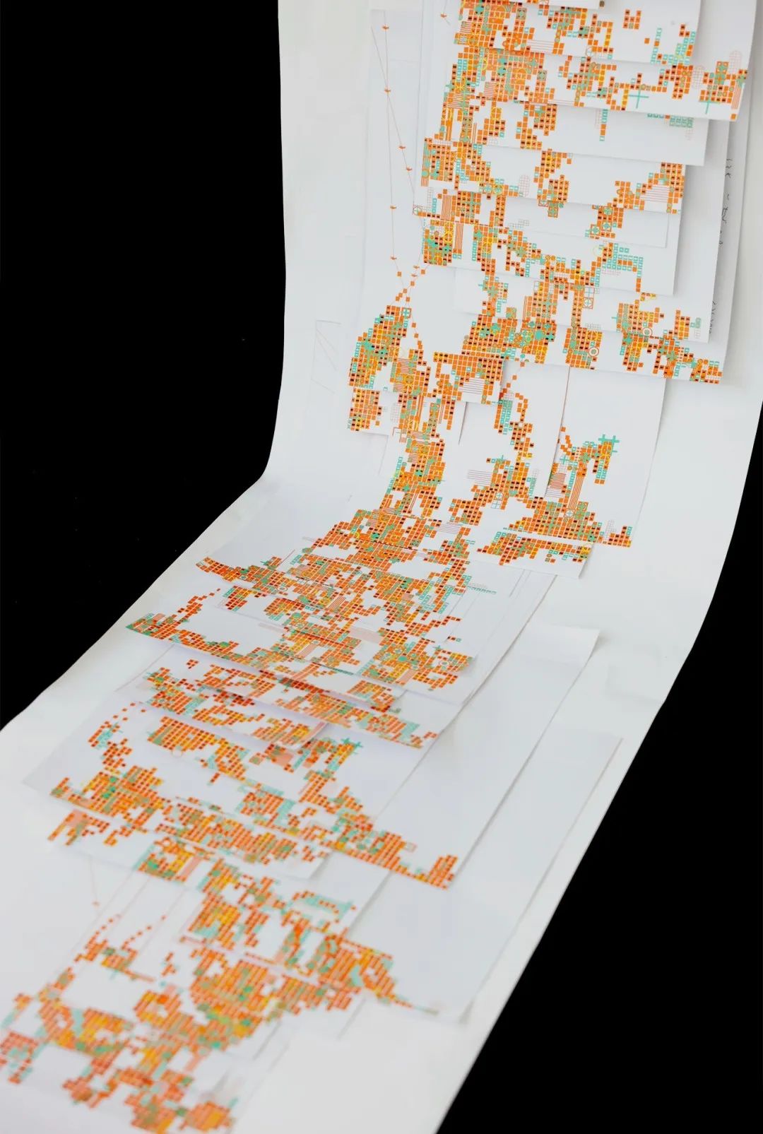
《后“码”村》以城市化进程中乡村符号的“码化重构”为核心,通过构建一部新地方志,使其不仅作为“档案”记录乡村情感符号的消亡,更试图成为“抵抗宣言”揭露“码化”如何将乡愁压缩为冰冷的编码剔除符号的情感内核,以此质问城市化进程中“保护”与“抹杀”的悖论。但作品拒绝悲情叙事或虚假和解,作品希望通过暴露矛盾赋予老人“见证者——抵抗者”的双重身份,使其在撕裂中寻找自洽,对抗记忆和情感的数据异化。
Hou Ma Village centers on the "codified restructuring" of rural symbols in the process of urbanization, constructing a new local chronicle that functions as both archive and resistance manifesto. Far from passive documentation of rural emotional symbols' erosion, it serves as a critical intervention exposing how "codification" reduces nostalgia to sterile algorithms—stripping symbols of their affective cores. This dual role interrogates the urbanization paradox where "preservation" too often becomes annihilation. Rejecting maudlin narratives or facile reconciliations, the project repositions displaced elderly residents as witness-resistors—confronting contradictions to forge self-reconciliation. By affirming their emotional and cultural agency against digital alienation, the work transforms sites of memory fragmentation into platforms for resilient cultural negotiation.


左右滑动查看更多

左右滑动查看更多


左右滑动查看更多
导师评语 Mentor's Review
首先,这是一件有温度的作品。作品中包含了作者对亲人、对故乡深切的感怀,这种情感不仅激发了作者的创作灵感,更重要的是成就了此作品在创意内核与视觉语言上形成了独特且生动的设计张力。作品主题中的“码”代表着记忆中的一切被标记、被拆解、被模糊,作者用视觉导演了一场在数字化时代背景下与过去、与熟悉、与记忆的告别。一件好的设计作品除了拥有吸引眼球的形式之外,同时也必然需要一个能引起共鸣和思考,达到共情和通感的好内容。所以,这也是一件动人的作品。
This is, first and foremost, a work of emotional resonance. Embedded within lies the artist's profound nostalgia for family and hometown—a sentiment that not only ignited creative inspiration but, more crucially, crystallized into a unique and vivid design tension between creative core and visual language. The project's central motif of "coding" symbolizes how memory becomes labeled, dissected, and blurred in the digital age; through visual storytelling, it stages a farewell ritual to the past, the familiar, and the remembered. Beyond its striking form, the work excels as resonant content that provokes reflection and empathy—a testament to how meaningful design transcends aesthetics to forge collective understanding. This duality of poignant emotion and conceptual rigor renders it a truly affecting artistic intervention.
杨双飞 YANG Shuangfei
Hou Ma Village, a large-format publication by final-year VCD student Shaqi, is a poignant exploration of cultural memory, displacement, and emotional identity in the face of urbanisation. Centered on the lived experiences of elderly villagers (specifically inspired by Shaqi's own grandmother) the work critiques the codification of rural culture into abstract digital symbols, exposing the emotional void left behind.
The title plays on a linguistic pun: "Ma" means both "mother" and "code" in Chinese, transforming Hou Ma Village into a layered metaphor for how emotional memory is being re-encoded into detached visual data. The project blends modular layouts, coded graphic systems, traditional binding methods (notably the dragon-scale format), and poetic visual storytelling to reimagine how memory can be preserved beyond cold digitisation.
Structured across four parts, the publication traces the impact of demolition policies through symbols like trees and household objects, rituals, and personal relationships. Research methods (including interviews conducted across dialect barriers and close visual observation) inform the deeply empathetic design approach. Rather than promoting quick adaptation to urban life, Shaqi's work foregrounds the emotional and cultural displacement that persists long after physical relocation.
The project is both a memorial and a resistance piece. It challenges the dominant role of design as a tool for integration or problem-solving and instead repositions it as a means of emotional documentation. By weaving together code and craftsmanship, personal memory and collective critique, Shaqi delivers a timely reminder: cultural preservation without emotional depth is empty.
《后码村》是视觉传达设计专业应届毕业生莎淇创作的大型作品,以城市化进程中文化记忆、被迫迁徙与情感认同为核心,展开了一场犀利的探索。作品聚焦老年村民的生存体验(灵感源自莎淇祖母的亲身经历),批判了农村文化被异化为抽象的数字符号的编码过程,揭露其背后留下的情感真空。
标题暗含双关:“后码”既指涉物理空间的“后村”,又隐喻数字时代的“后代码”——将“妈”(母亲)与“码”(代码)的语义重叠转化为多层隐喻,暗示情感记忆正被重构为退却温度孤立的视觉数据。项目融合模块化版式、编码图形系统、传统装订工艺(尤以龙鳞装为特色)与诗性视觉叙事,试图超越冰冷数字化,重构记忆的保存范式。
全书分四章展开,通过树木、家居物件、仪式习俗及人际关系等符号,追溯拆迁政策对乡村肌理的侵蚀。研究方法论(跨越方言障碍的深度访谈与视觉人类学观察)奠定了充满人文关怀的设计策略。莎淇的作品并未赞美对城市生活的快速适应,而是聚焦于物理迁移后长久存续的情感与文化失重。
这部作品既是记忆档案,更是抵抗宣言。它挑战了设计作为同化工具或问题解决者的主流定位,转而将其重新定义为情感记录的手段。通过将代码和匠艺、个人记忆和集体批判交织在一起,莎淇及时提醒我们:没有情感深度的文化保护是空洞的。
Ruehl Muller
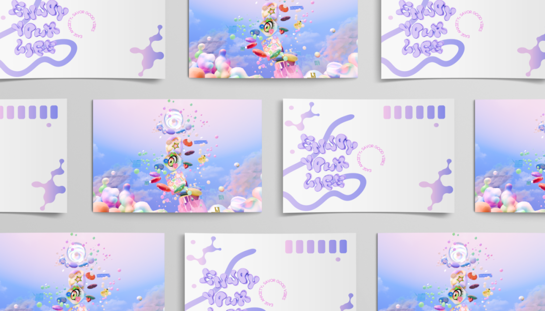
涟漪
RIPPLE
视觉传达设计
Visual Communication Design
伊然 YI Ran
指导老师|Caleb Fahey 甘森忠 GAN Senzhong
作品介绍 Intro
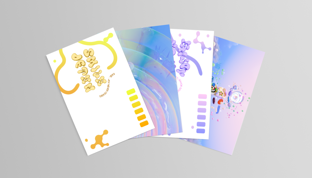
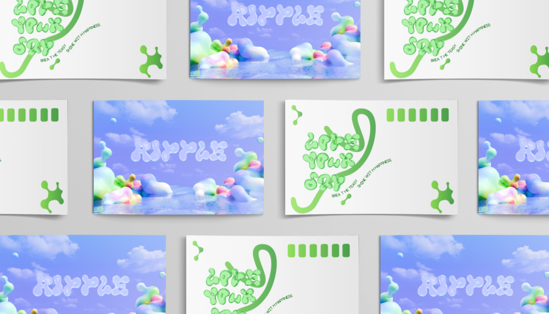
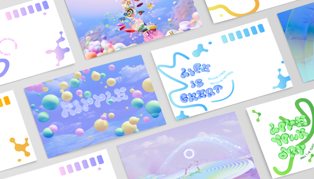
该游戏项目取名为RIPPLE,中文的意思为“涟漪”。游戏命名灵感来源于蝴蝶效应,在游戏中任何一次微小的干预都有可能带来长期的情绪改善。设计目标:通过轻松有趣的治愈系游戏设计和音乐,帮助喜欢通过可爱事物进行解压的玩家成功释放心理压力,降低焦虑水平。
The game project is named RIPPLE. The inspiration for the game's name comes from the butterfly effect, where any small intervention in the game has the potential to bring about long-term emotional improvement. Design objectives: Through the design of a relaxing and interesting healing-style game with cute visuals and music assistance, it aims to help players who like to relieve stress through cute things successfully release psychological pressure and reduce anxiety levels.


左右滑动查看更多
左右滑动查看更多
导师评语 Mentor's Review
I am proud of Yi Ran's accomplishments throughout the Visual Communication degree. From her early projects to her final major project, she has consistently applied herself across all units and has developed significantly as a designer.
Her final project tackled the urgent issue of mental health, exploring how immersive experiences can support the treatment of childhood trauma through gamified therapeutic interventions. She approached this theme with creativity and innovation, drawing on elements of "cute culture" to design an engaging, immersive world that encourages users to improve their mental health and well-being in a playful and safe environment.
In a time when attention is increasingly commodified, it is essential that emerging designers find ways to harness technology and design in support of healing and human growth. Yi Ran's work reflects this ethos, and her achievements at ICI stand as a testament to her talent and potential in the creative arts. I wish her every success in the future and look forward to seeing how her skills continue to evolve.
我为伊然在视觉传达设计专业求学期间取得的成就深感自豪。从早期项目到最终的毕业设计,她始终以高度专业态度投入各阶段的学习创作,作为一名设计师,实现了跨越式成长。
其毕业设计聚焦有关心理健康的一个紧迫议题,探索沉浸式体验如何通过游戏化治疗干预支持儿童创伤修复。她以创新视角切入主题,巧妙运用"可爱文化"元素构建出一个引人入胜,身临其境的世界,在既有趣又安全的环境中引导使用者改善心理状态,提升幸福感。
在注意力日益商品化的时代,新生代设计师必须找到利用技术和设计来支持治疗和人类成长的方法。伊然的作品反映了这种理念,她在ICI的成就证明了她在创意艺术方面的才华和潜力。我祝愿她未来一切顺利,并期待看到她的技能继续发展。
Caleb Fahey
伊然同学的毕业设计《RIPPLE》以“可爱文化”现象为背景,结合游戏的方式为受众设计一款解压的小游戏及其相关的视觉。
游戏场景设计大量运用轻微浮动、柔和可爱的圆形元素,配合空旷自然的环境设定,营造出轻盈、自由的空间感。同时,精心设计的动态效果,让游戏互动充满趣味性与解压感,使玩家在操作过程获得情绪释放。总体设计采用高明度的蓝色调为主色,搭配柔和的紫色与浅绿色,构建出清新治愈的色彩体系,从视觉层面舒缓玩家情绪。
该设计可以看出其对可爱文化现象的理解与探索,并能付诸设计实践,整体的设计视觉轻松活泼,动态流畅。
Yi Ran's graduation project RIPPLE is based on "cute culture" phenomena and adopts game style to create a stress-relieving microgame and its related visual system.
The game scene design extensively utilizes slightly floating, gentle and cute circular elements, set in an open and natural environment, to create a sense of lightness and freedom in space. At the same time, as a result of meticulous design, playful interactions enhanced by kinetic animations deliver both engagement and cathartic release, enabling emotional liberation through gameplay. A vibrant blue palette dominates, complemented by soft lavender and mint accents, forming a refreshing therapeutic color system that visually soothes users.
The work demonstrates nuanced understanding of cute culture's psychological appeal, translating conceptual exploration into tangible design practice. The overall aesthetic balances lively visual energy with fluid motion design, achieving a cohesive and emotionally resonant experience.
甘森忠 GAN Senzhong
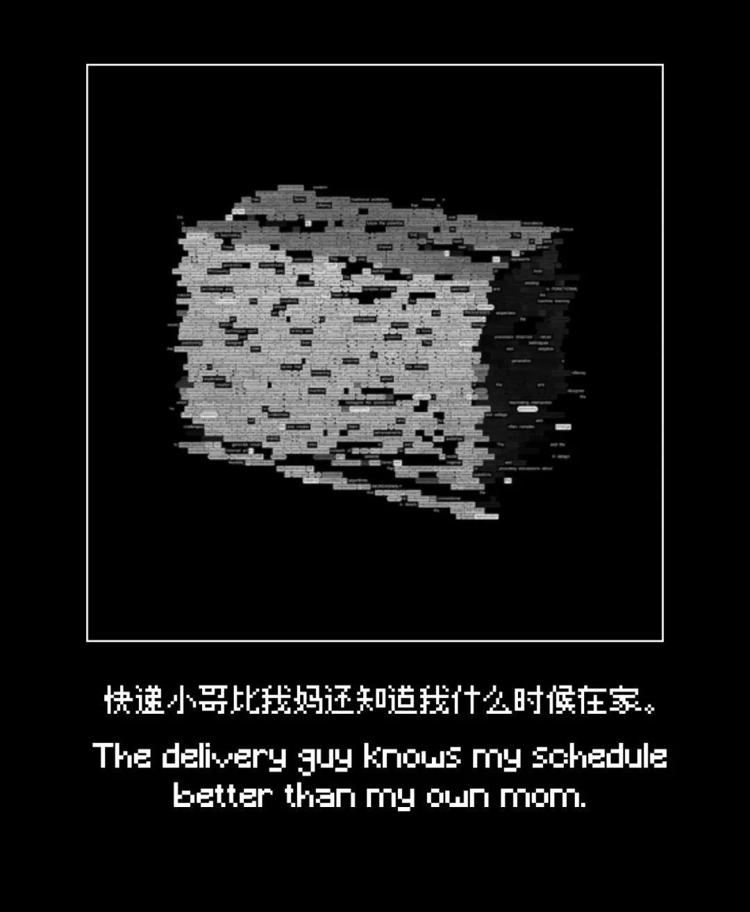
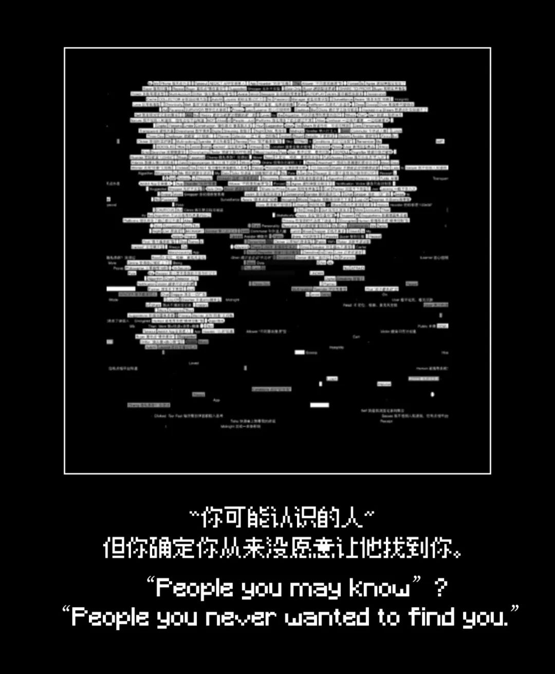
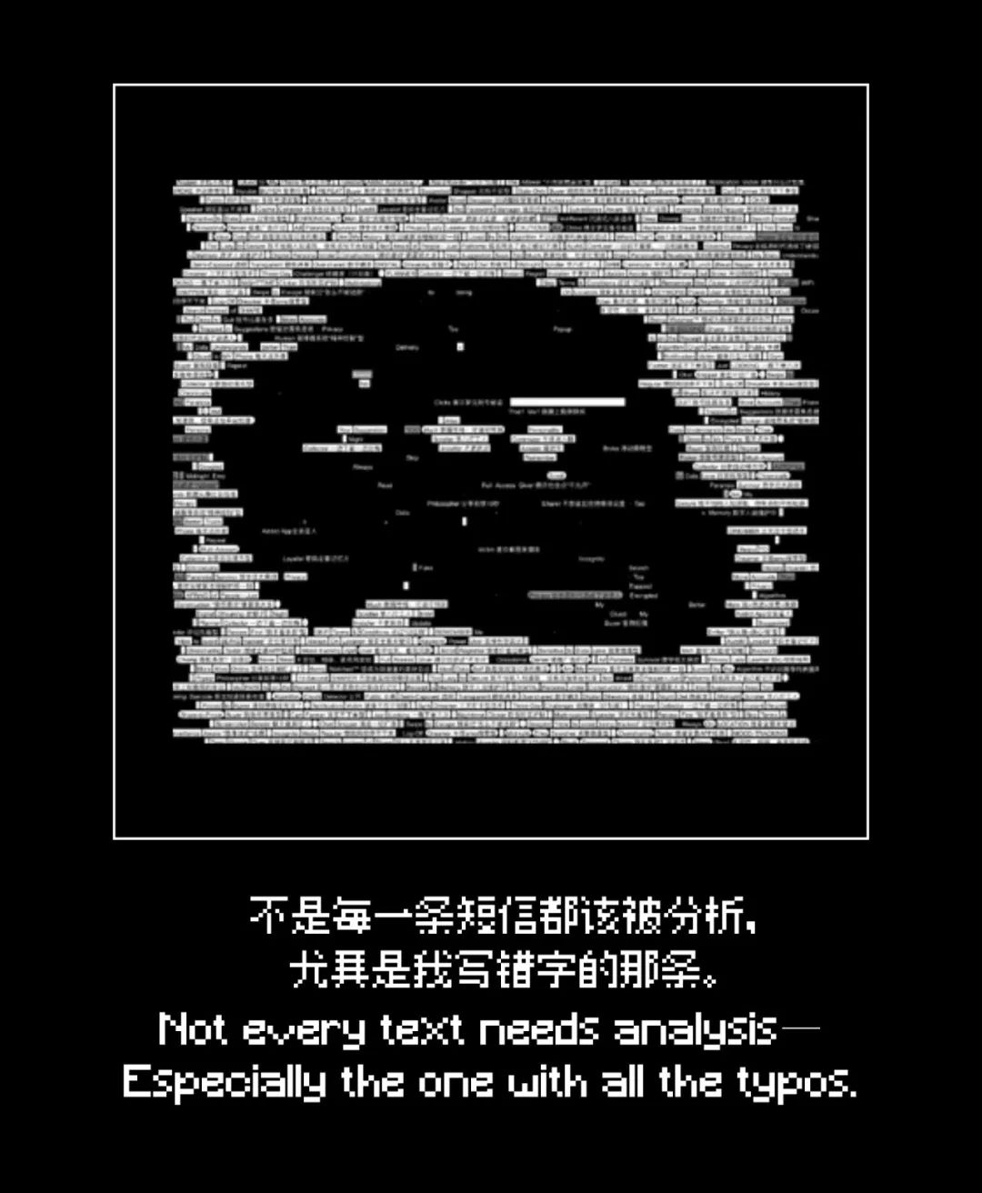
数据之痕
Trace of Data
视觉传达设计
Visual Communication Design
熊禹欣 XIONG Yuxin
指导老师|甘森忠 GAN Senzhong Ana Menezes
作品介绍 Intro
《数据之痕》以快递单、外卖单、购物小票等生活单据为切口,揭示大数据时代中日常隐私被动泄露的现象。通过视觉设计手法,将看不见的数据流动转化为可感知的图像表达,唤起人们对数字身份安全的反思。
Trace of Data explores how ordinary receipts—like delivery slips, food orders, and shopping bills—silently expose personal privacy in the digital age. By the design method of visualizing invisible data flows, the project aims to raise the awareness of digital identity and the traces we unknowingly leave behind.


左右滑动查看更多


左右滑动查看更多
导师评语 Mentor's Review
熊禹欣同学的毕业设计《数据之痕》聚焦于大数据时代日常隐私泄露问题。以快递单、外卖单、购物小票等日常生活的单据为切口,通过数字的动态影像、互动传播、纸质的海报等呈现,以批判性的视觉设计构建出一个数字时代隐私信息泄漏的特有现象。作品形式多样、信息逻辑清晰,既具设计思辨性,也展现了良好的视觉控制力与执行力。展陈方式主次分明,动态视觉呈现丰富有序。整体设计体现该同学敏锐的问题意识与图像语言转化能力,也体现出作为设计创作者的独立判断力与社会责任感。
Xiong Yuxin's graduation project Traces of Data focuses on the issue of daily privacy breaches in the era of big data. Using ephemeral documents like parcel receipts, food delivery orders, and shopping bills as points of entry, with a critical visual design, the work deploys dynamic visuals, interactive installations, and print posters to construct a provocative phenomenon of privacy breaches unique in the digital age. The works are diverse in form and have clear information logic, which not only demonstrates design speculation, but also good visual control and execution ability. The way of exhibition is clear in priority, and the dynamic visual presentation is rich and orderly. The overall design reflects the student's keen problem awareness and ability to transform visual language, as well as his independent judgment and sense of social responsibility as a design creator.
甘森忠 GAN Senzhong
Traces of Data is a critical design project by XIONG Yuxin that examines the erosion of privacy in our data-driven society. By transforming everyday receipts and packaging into visual metaphors for surveillance, the project reveals the invisible systems of data collection embedded in ordinary transactions. Drawing on personal experience and contemporary research, Yu Xin explores how design can surface hidden structures and prompt reflection on digital identity, consent, and control. Through a compelling use of format and visual language, the project challenges viewers to reconsider the cost of convenience in an age of constant algorithmic observation.
《数据之痕》是熊禹欣开展的一项批判性设计项目,聚焦数据驱动型社会中对隐私的侵犯。项目将日常收据与包装以视觉形式隐喻为监控的对象,揭示普通交易中安置的看不见的数据采集系统。基于个人经历与当代研究,禹欣探索设计如何将隐藏的结构浮出水面,并引发对数字身份、同意和控制的反思。通过令人信服地使用格式和视觉语言,该作品使观众重新审视在常态化的数据监控时代下便利的成本。
Ana Menezes

如需合作请电话联系或加微信,18637207311(微信同号)
本网站中未标注“来源或是标注“来源**(网站)”的作品,均转载于第三方网络平台,本网站转载系出于传递设计大赛信息之目的,不保证所有赛事的准确性、和完整性,请您在阅读、创作过程中自行确认,不代表本站的观点和立场,版权归原作者所有。若有侵权或异议请联系我们删除。如遇下载附件无权限,请使用谷歌浏览器下载!


